How does a mental health portal for youth expand its reach to adults?
CLIENT
Acceset (pronounced “asset”) is a social enterprise that provides emotional support to youths in Singapore.
PROJECT TYPE
Desktop website redesign
TEAM & ROLES
Calista Chen: Information Architecture Lead, Usability Testing, Content Writing
Hau Yee Wong: Visual Design Lead, UX Research
Victoria Neoh: UX Research Lead, Visual Design, Usability Testing
Yilynn Chan: Project Manager, Content Design Lead, Usability Testing
Challenges
-
Improve the usability of the letter writing platform.
-
Update the visual design and copywriting to enhance the credibility of the service.
Executive Summary
Our client intends to expand their current user demographic from students and youths to encompass working professionals. They also have plans to start monetising their services. We needed to help get the website ready for this new direction.
Outcomes
-
Reduced steps needed for new users to send a letter on the platform.
-
Gave users freedom to pick the Befrienders they wish to confide in.
-
Clearer site navigation and added SEO and content distribution benefits.
-
Enhanced new user understanding of product concept.

.png)
Client
Meet Acceset!
Their main services:
1
Letter exchange: Digital anonymous written correspondence platform.
2
Befriender Programme: Digital empathy skills training programme for volunteers to respond to those seeking emotional support.
Their core users:
Seekers: Users of the correspondence platform in need of emotional support.
Befrienders: Acceset-trained volunteers who provide emotional support to Seekers.
Originally created to serve students and youths in need of emotional support, our client shared their broader vision and new business direction for Acceset.
They intend to expand their target audience for their letter exchange platform to working professionals.
They also plan to monetise the Befriender Programme as a subscription for companies looking to provide training to their staff.
Research
Getting Into The Headspace
To first understand Acceset and the service landscape, we conducted the following:
-
User interviews
-
Benchmarking
User Interviews
We spoke to 15 users and discovered these insights:

Seekers
-
10 users interviewed
-
All Singapore based
-
Working professionals
-
Ages 20 - 39
Insights
-
Prioritises anonymity when confiding.
-
Wants to be able to be paired with a therapist/listener who would be a right fit.
-
Needs to know the credibility of the organisation they would be getting support from.

Befrienders
-
5 users interviewed
-
All Singapore based
-
Past and current Befrienders
-
Ages range from under 20, 20 - 29 and over 50
Insights
-
Needs to know the credibility of the organisation they would be working with.
-
Knowing full details and requirements of a volunteering opportunity is important.
We composed two personas based on the insights from our user interviews.
Seeking Sammy
Marketing Executive, FMCG | Age 29
Behaviours
-
Writes in a journal as a release.
Frustrations
-
Lacks a strong social support network.
-
Fears judgement if he confides in coworkers.
Needs and Goals
-
Share his problems with someone who has gone through similar experiences.
-
Anonymity in his therapy sessions
-
Address issues promptly to avoid forgetting.

“I feel I am not good enough and am overwhelmed with work. I tried journalling to organise my thoughts.”
Helpful Hannah
Counsellor, Family Service Centre | Age 35
Behaviours
-
Explores volunteer opportunities outside work.
Frustrations
-
Limited bandwidth to volunteer.
-
Volunteering is emotionally draining.
Needs and Goals
-
Connect with clients that match her expertise.
-
Confidence in an organisation’s credibility before volunteering.
-
Full details on her role and expectations
before volunteering.
"There is great value in being someone's listening ear."

Benchmarking
We also looked at competitors in the digital teletherapy space to learn about their user journeys, unique selling propositions and what could be done better.
7 Cups
Offers online therapy and free emotional support by connecting users with trained listeners.
What we learnt
-
Having a high volume of listeners to pick from is overwhelming.
-
Metrics on how active or well-rated a listener is help users choose listeners.
BetterHelp
Connects users with counselling and therapy services via web-based, phone and text interaction.
What we learnt
-
Clear service provider information, facts, data, reviews and ratings establish user trust.
-
Lengthy onboarding deters users from trying the service.
Mindline.sg
Provides tools, tips and resources to help users learn about and manage their health and wellbeing.
What we learnt
-
Sending vulnerable users to chat to an AI bot does not address their issue.
-
Calming and minimalist aesthetic creates an enjoyable user experience.
Define
What's The Problem?
From our research, we identified two distinct needs from Seeker and Befriender perspectives.
Users need access to mental health care and emotional support that is responsive to their needs.


Users need to be convinced of an organisation’s credibility before they opt to offer their service.
Ideate
From Paper to Pixels
We conducted a design studio with our client to generate ideas and sketches on how to improve crucial touchpoints.

Design
The Glow Up
Our website redesign encompassed four main initiatives:

User flow
improvements

Content design
.png)
Information architecture

Visual design
User Flow Improvements

We made these key improvements to the Seeker's user flow guided by our research:
Reduce Steps
We gave new users the option to start writing immediately. The impacts of this are:
-
Reduce the steps to start letter writing.
-
Accommodates users who feel vulnerable and want to write immediately.
-
Forgo lengthy onboarding process by offering default, preset account settings.
5
9
Give Users Choice
Users are assigned Befrienders randomly but they prefer being able to pick. This gives them confidence that they will get be a better fit.
We added profiles to help users get to know Befrienders. Aliases preserve anonymity.
Seekers can browse profiles and connect.

Content Design
The main goal was to enhance the credibility and perception of trust in the Acceset's services. We did this with three content pillars: Educate, Standardise and Clarify.
Educate
1
Reorganised content flow to prioritise important information first
2
Added industry data and press features to educate users about the mental health industry
.png)
Standardise
1
Changed seekers and befrienders to proper nouns to reinforce their presence and identities on the platform.
Seekers
Befrienders
2
Standardised the copy and colour of the call to action buttons for respective user journeys.
Seeker buttons


Befriender buttons
.png)

Clarify
To cater to quick reading habits, content is presented clearer and more easily digestible. We used succinct, jargon-free language and simplified the copy into shorter sentences.
Information Architecture
To make information more searchable and the website easier to navigate, we made these changes to the sitemap and navigation:
1
2
Issue
Solution
Outcome
Each global navigation category is a single page. Users do not know the content of each page.
Break down single pages into subcategories under global navigation with more detailed information.
Clearer site information for users. New pages can be shared for SEO and content distribution.
Global navigation pages are calls to action with no clarity of where they would lead to.
Replace calls to action with Letter Writing and Befriender Programme.
Main services are displayed front and centre. Terminology is consistent on the site.
Changes made to the sitemap
Visual Design

The original platform and brand were designed for school-going audiences. To appeal to our client’s new, older target audience, the brand’s visual design needed to mature.
Ageing Gracefully
We darkened the tone of the current brand colour palette to help the brand appear more professional, reliable and mature.
Primary
Highlights, headlines,
action colours
Secondary
Highlights, headlines,
action colours
Background
Banner, cards, aesthetic components


Logo update
The new colours also apply to Acceset's logo. Solid colours replace the gradient to give it a modern look.
Colours
We darkened the current colour schemes to appeal to a more mature audience and raise the sense of professionalism and reliability.
Primary
Highlight, headlines, "action" colours
Secondary
Highlight, headlines, "action" colours
Background
Banner, cards, aesthetic components


The colour changes also applied to the logo. We replaced the gradient with solid colours. Teal represents the Seekers and orange represents the Befrienders.
Visual Aids
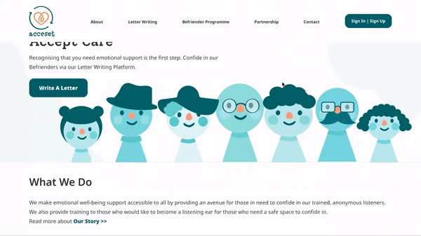
We expanded the visual library to help the client communicate their concepts clearly. Although we wanted to make this service appear more mature, we decided to retain the illustrations to preserve the friendliness of the service and help it stand out.
New infographics visualise how the Letter Writing platform and Befriender Programme works.

This helps users understand the services better.


As an added bonus
we also created more characters


for use across the website!
Test
How Did We Fare?
We moderated two rounds of usability tests with both our low and high fidelity prototypes. Users had to:
-
Create an account and send a letter.
-
Switch to a more suitable Befriender to confide in.
What Went Well
From both rounds of testing, there were standout observations of what went well on our prototypes:
5/5
Could easily describe how the Befriender Programme works as new users.
users
4/5
Found the onboarding
process simple, straightforward and manageable.
users
4/5
Opted to write a letter right away instead of signing up first.
users
3/5
Liked being able to choose a Befriender that they felt they could relate to.
users
What Didn't Go Well
We also identified a couple of key usability issues from each test round, which informed the updates to our final prototype.
Issue
1
Users felt the "Write a Letter" call to action misled and forced them into creating an account.
Improvements
Updated user flow to let users opt to write a letter before signing up first or vice versa.
2
Users found the onboarding process too long, instead expecting to start writing after signing up.
Reduced fields to fill, broke up the questions to one per page and offered the option to “Skip”.
In Retrospect
Looking Back At The Things We've Done
Our client loved our design proposals! 🎉
Hooooowever, their feedback focused on the option to write a letter immediately.
They had implemented this user flow in a very early iteration of the website, but subsequently removed it due to issues over security and personal data privacy, as well as trolling.
In hindsight, we could have allayed their doubts by:
1
Presenting the user flow in concern during our prototype walkthrough.
We moved the mandatory account signup to after letter writing. A lite version reduces friction to sending a letter as a new user.
2
Asking our client earlier in the project if he had implemented this user flow before.
We would've gained more insights and avoided spending time on it if it was not feasible.
So, What Next?
We suggested the following actions to our client, and intend to follow up with them on what implementations they intend to take:

Expand research into potential target audiences for the Befriender Programme.

Implement and test the new website structure and content as per our redesign.

Make his website mobile responsive to cater to his mobile-forward users.